Saturday, March 27, 2010

Moving Day

Census 2010 fever has gripped the nation, and needless to say this Map Nerd is having nightly palpitations thinking about the maps I'm going to be able to make once the data is available.

In the meantime, however, the US government has created a new web site, data.gov, to serve as a central source for finding government-published data made available freely to the public.

And as it turns out, quite a bit of data is made available between each census by other government agencies. The IRS for example knows who moves to a different address, a different county or a different state each year, and as it turns out they make this data available each year.

The latest data available is for people who changed addresses in 2007-2008, in other words, people who filed taxes or filed for an exemption with a different address for 2008 income than they used for their 2007 declaration.

Both in-flows and out-flows are available, so you can see for a given county where all the people who moved there during the year were previously resident, or where all the people who left a given county that year moved to.

My first instinct, given the collapse of the US economy in late 2008, was to see which counties were losing taxpayers like so much unemployed investment banker ballast. But as it turns out, the map was very boring. There weren't massive moves from Manhattan to Alabama as a result of the financial meltdown. The biggest loser was Chattahoochee County, Georgia (for more reason than one obviously). But nearly everyone that left the county moved to neighbouring Muscogee County. I can only assume that county line was redrawn, a trailer park was relocated, or the locals suddenly realised that their county's name meant "discourse with a prostitute" in the language of today's youth and decided to go walkabout.

I'll take door number two.

In-flows turned out to be far more interesting than out-flows, because they show the places that people are moving to certain cities/counties from.

I ended up creating a series of maps this time, showing the counties of origin of people who moved to some of the major US cities between 2007 and 2008, and as a comparison also created the same map for two smaller cities, Sioux City and Columbus.

Each map comes in two versions. The "linear" colour scale and the "quantile" colour scale. Both maps display data that shows, for a given county of destination, which counties the migrants originally lived in in 2007.

To read these maps, say for New York, looking at a county that has a colour corresponding to 0.5%, you should be read "0.5% of all migrants moving to New York in 2007-2008 are from this county".

"Linear" scale maps give a good idea of where the raw majority of migrants are from. The darkest counties are the ones where a lot of people came from.

"Quantile" scale maps give a better idea of the spread of counties of origin. On this map, you'll see all the counties that have beween 0.001% and 0.1% much more easily.

People moving from Hawaii, Alaska, Puerto Rico and the other US territories, as well as from foreign countries, are taken into account in the calculation of the percentage, but are not represented on the maps.

How "lower 48" of me. Sarah Palin would be livid.

So, with just the above ado, I give you... MAPS!!

(As always, click to enlarge)


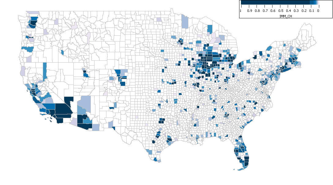
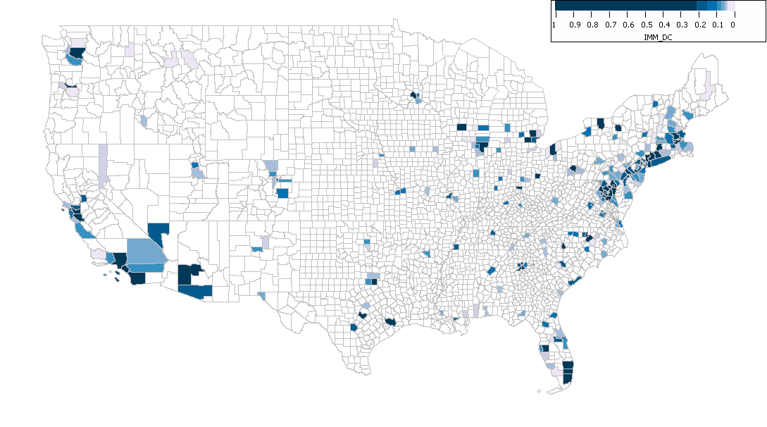
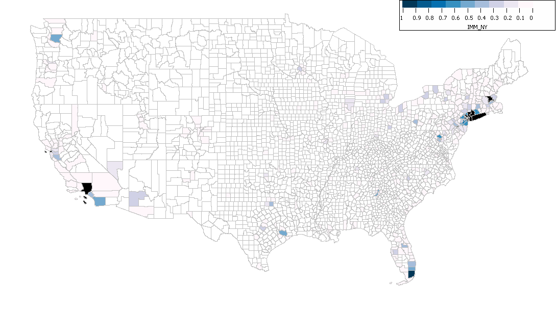
If any conclusion can be drawn from these maps, I'd say that looking at the linear scale ones especially, it's obvious that people who move to big US cities come principally from other big cities, or from the immediate suburbs. And people who move to smaller US cities move from the rest of the state.

I'm brewing up an idea at the moment. A web site that can generate maps on the fly. But not like the crappy ones government web sites serve up. Interesting, interactive ones that will for example let you choose a county out of the whole list of what exists and map the in- and out-flows by county of origin/destination on demand.

Watch this space!

Thursday, January 14, 2010

Maps of places you'll never go

I just today discovered that the MICRODEM software I use often is capable of loading IMG files of elevation data of the Moon, taken by the Clementine in the 90's.

I'm still looking for interesting lunar features to map out, but here's a sneak preview.


(Click to enlarge)

I have no idea where it is, but i'n'it gorgeous?

Ever wonder what an Earth mountain would look like compared on the same kind of map to a lunar mountain of similar height? (Yes, I'm sure you have.)


(Click to enlarge)

On the right, weighing in at 1900m, we have Mount Washington, New Hampshire, United States. The highest peak in the northeastern United States. In it's shadow, Bretton Woods, where the fundamentals of the modern international financial system were laid.

On the left, weighing in at, 4600m, yes you heard me, 4600 metres above lunar "sea level" (ooh, something I'm going to have to look up on The Google now), Mons Hadley. In its shadow... the base from which the future interplanetary financial system will be laid? Nah, probably not. I'm sure it'll be thought up somewhere in an international organisation. By a committee!

Or perhaps just by a lonely astronaut.


(♫ There's gonna be one less lonely astronaut ♫)

Monday, January 4, 2010

Northeast American Railroad Network

Today's map is finally not just another Montréal downtown map of demographic data! Three cheers!

Montréal is on the map, but not exclusively.

Behold, the sadly underused (for passenger services) railroad network of the Atlantic Northeast!


(Click to enlarge)

Sources today are the STRM satellite elevation files no longer graciously made available by NASA (more tax money well spent), and completely random North American Transportation shapefiles downloaded from mapcruzin.com. They may not be 100% accurate, but it's believable enough for me!

Railroads located in the US are in red, and those in Canada are blue.

Saturday, January 2, 2010

Housing Unit Occupancy in Central Montréal

In what is probably going to be a series of several Montréal maps (since I did spend quite a few hours putting together the shapefile), here now are three maps showing what I showed previously for Manhattan -- the rate of owner-occupied, renter-occupied and vacant dwellings.


(Click to enlarge)


(Click to enlarge)


(Click to enlarge)

I'm willing to bet there are a few methodological differences between how the U.S. Census Bureau tabulates what they call "housing units" and whether they are considered owner-occupied, renter-occupied or vacant, and what Statistics Canada / Statistique Canada does with what they call "dwellings". But I'm not willing to look it up right now. :)

Friday, January 1, 2010

A Labour of Love

I've been trying to convince Statistics Canada to give me a free copy of a map they sell for a thousand dollars, which contains the census tracts of all the metropolitan areas in Canada. So far, no luck, but we'll see...

In the meantime, I spent a few hours tracing over the census tracts of downtown Montréal in the Epi Info shapefile editor, and managed to create a map covering an area from Pie-IX to NDG, and from the river to the A-40.

I also wrote a small program to repeatedly query Census Tract Profile data, which you don't seem to be able to download for more than one census tract at a time, and compile it into one big data file.

So now I can make maps covering a variety of themes, from language to education to employment and mode of transportation used to get to work.

My first map shows what percentage of residents of each neighbourhood either walk or cycle to work.

(Click to enlarge)

Not surprisingly a lot of people who live right downtown walk or cycle to work, but there are some zones further out where people do as well. The two areas that stick out, Lower Westmount / Saint-Henri and the Plateau / Rosemont, are also pretty mixed residential/commerce neighbourhoods, so perhaps it's people who live near where they work...?